Tabs
Overview
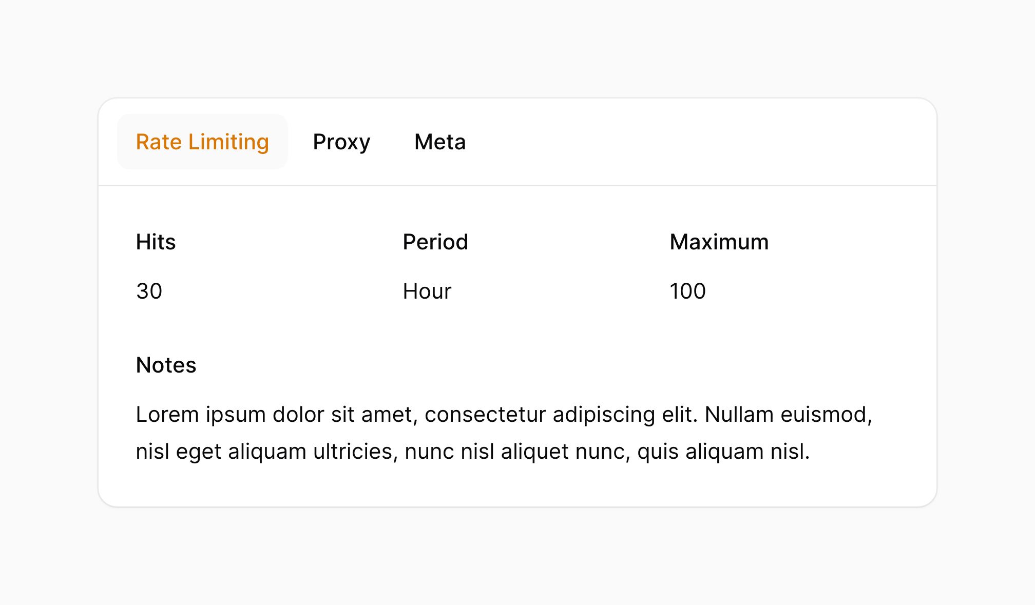
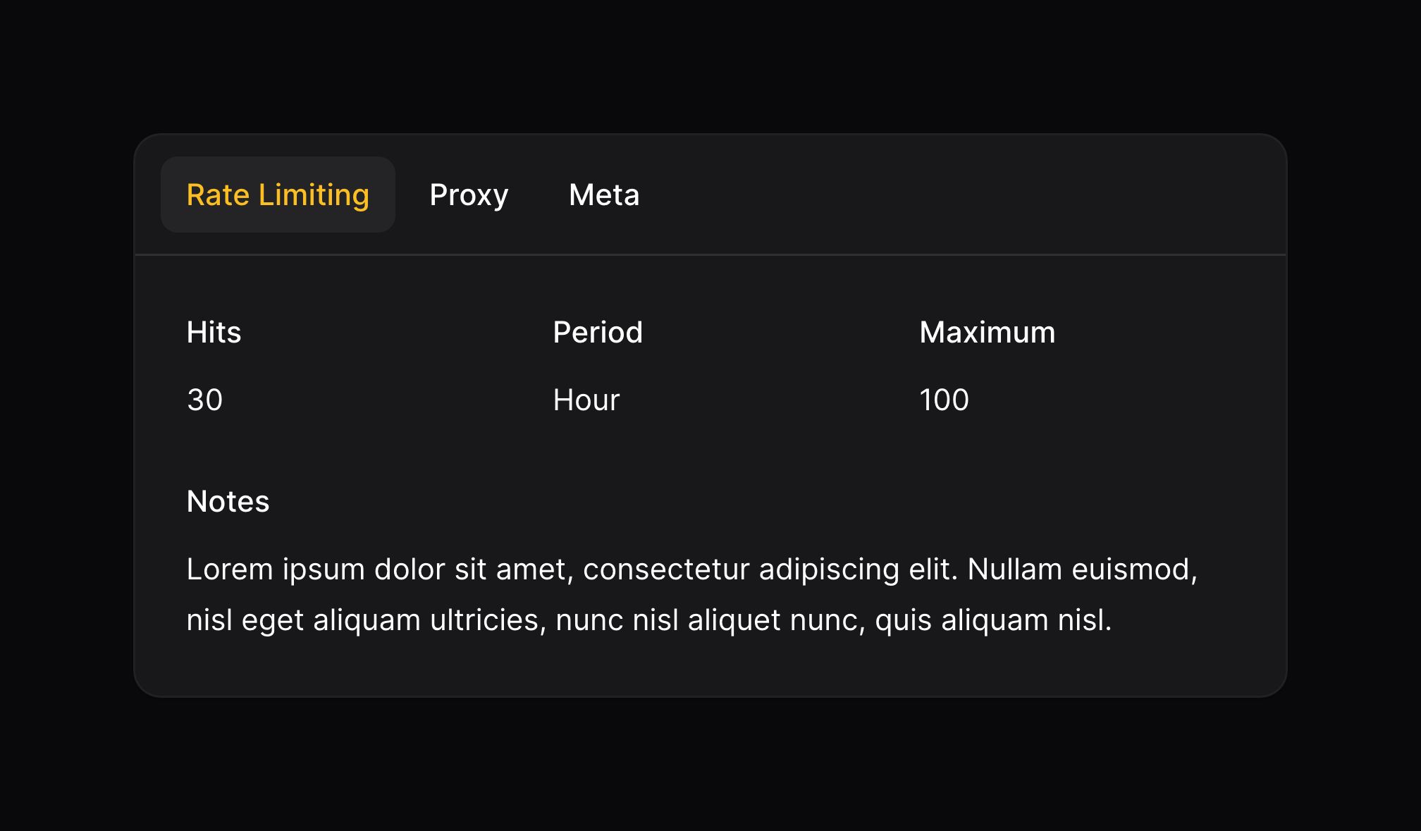
Some infolists can be long and complex. You may want to use tabs to reduce the number of components that are visible at once:
use Filament\Infolists\Components\Tabs;

Tabs::make('Label')
    ->tabs([
        Tabs\Tab::make('Tab 1')
            ->schema([
                // ...
            ]),
        Tabs\Tab::make('Tab 2')
            ->schema([
                // ...
            ]),
        Tabs\Tab::make('Tab 3')
            ->schema([
                // ...
            ]),
    ])
Setting the default active tab
The first tab will be open by default. You can change the default open tab using the activeTab() method:
use Filament\Infolists\Components\Tabs;

Tabs::make('Label')
    ->tabs([
        Tabs\Tab::make('Tab 1')
            ->schema([
                // ...
            ]),
        Tabs\Tab::make('Tab 2')
            ->schema([
                // ...
            ]),
        Tabs\Tab::make('Tab 3')
            ->schema([
                // ...
            ]),
    ])
    ->activeTab(2)
Persisting the current tab in the URL's query string
By default, the current tab is not persisted in the URL's query string. You can change this behavior using the persistTabInQueryString() method:
use Filament\Infolists\Components\Tabs;

Tabs::make('Label')
    ->tabs([
        Tabs\Tab::make('Tab 1')
            ->schema([
                // ...
            ]),
        Tabs\Tab::make('Tab 2')
            ->schema([
                // ...
            ]),
        Tabs\Tab::make('Tab 3')
            ->schema([
                // ...
            ]),
    ])
    ->persistTabInQueryString()
By default, the current tab is persisted in the URL's query string using the tab key. You can change this key by passing it to the persistTabInQueryString() method:
use Filament\Infolists\Components\Tabs;

Tabs::make('Label')
    ->tabs([
        Tabs\Tab::make('Tab 1')
            ->schema([
                // ...
            ]),
        Tabs\Tab::make('Tab 2')
            ->schema([
                // ...
            ]),
        Tabs\Tab::make('Tab 3')
            ->schema([
                // ...
            ]),
    ])
    ->persistTabInQueryString('settings-tab')
Setting a tab icon
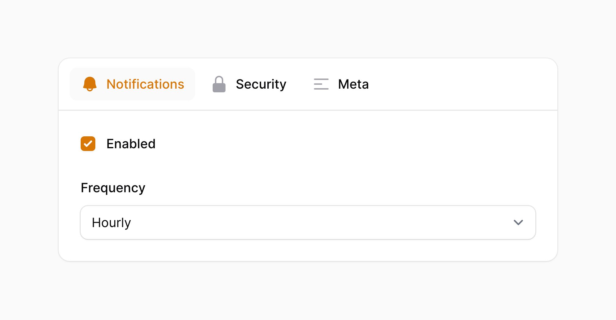
Tabs may have an icon, which you can set using the icon() method:
use Filament\Infolists\Components\Tabs;

Tabs::make('Label')
    ->tabs([
        Tabs\Tab::make('Notifications')
            ->icon('heroicon-m-bell')
            ->schema([
                // ...
            ]),
        // ...
    ])

Setting the tab icon position
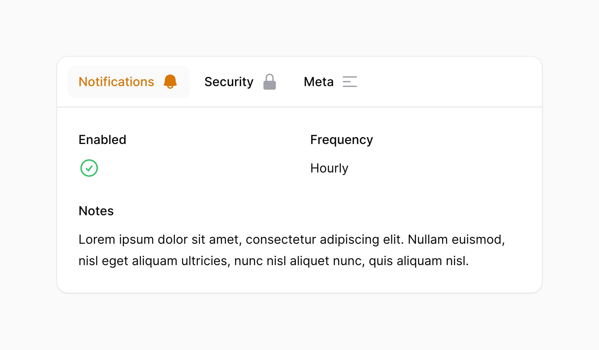
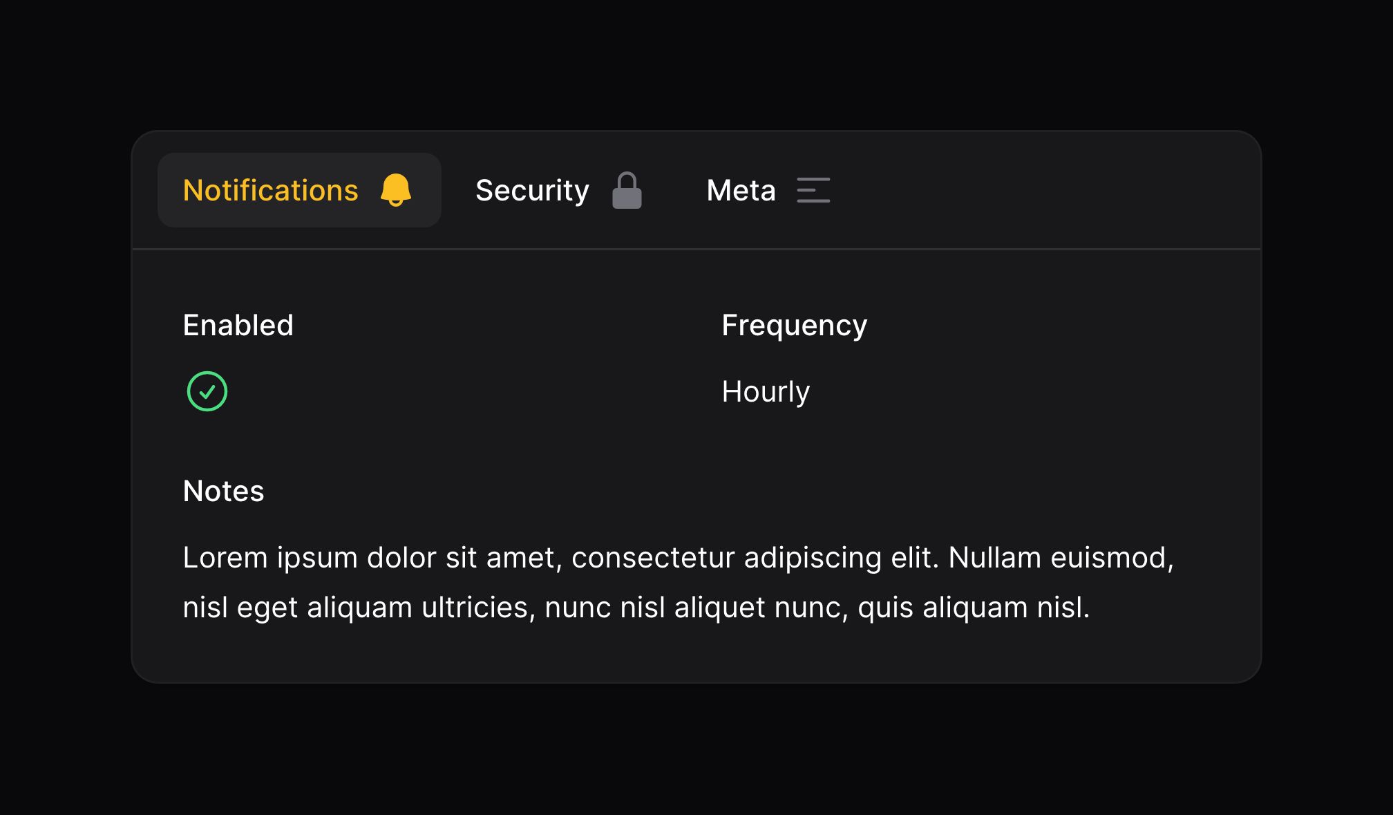
The icon of the tab may be positioned before or after the label using the iconPosition() method:
use Filament\Infolists\Components\Tabs;
use Filament\Support\Enums\IconPosition;

Tabs::make('Label')
    ->tabs([
        Tabs\Tab::make('Notifications')
            ->icon('heroicon-m-bell')
            ->iconPosition(IconPosition::After)
            ->schema([
                // ...
            ]),
        // ...
    ])
Setting a tab badge
Tabs may have a badge, which you can set using the badge() method:
use Filament\Infolists\Components\Tabs;

Tabs::make('Label')
    ->tabs([
        Tabs\Tab::make('Notifications')
            ->badge(5)
            ->schema([
                // ...
            ]),
        // ...
    ])


Using grid columns within a tab
You may use the columns() method to customize the grid within the tab:
use Filament\Infolists\Components\Tabs;

Tabs::make('Label')
    ->tabs([
        Tabs\Tab::make('Tab 1')
            ->schema([
                // ...
            ])
            ->columns(3),
        // ...
    ])
Removing the styled container
By default, tabs and their content are wrapped in a container styled as a card. You may remove the styled container using contained():
use Filament\Infolists\Components\Tabs;

Tabs::make('Label')
    ->tabs([
        Tabs\Tab::make('Tab 1')
            ->schema([
                // ...
            ]),
        Tabs\Tab::make('Tab 2')
            ->schema([
                // ...
            ]),
        Tabs\Tab::make('Tab 3')
            ->schema([
                // ...
            ]),
    ])
    ->contained(false)