Icon entry
概述
IconEntry 渲染一个表示其内容的图标:
use Filament\Infolists\Components\IconEntry;

IconEntry::make('status')
    ->icon(fn (string $state): string => match ($state) {
        'draft' => 'heroicon-o-pencil',
        'reviewing' => 'heroicon-o-clock',
        'published' => 'heroicon-o-check-circle',
    })
本函数中,$state 是 Entry 的值,并且 $record 可用于访问底层的 Eloquent 记录。
自定义颜色
IconEntry 也有一套图标颜色,使用相同的语法。可以是 danger、gray、info、primary、success 或 warning:
use Filament\Infolists\Components\IconEntry;

IconEntry::make('status')
    ->color(fn (string $state): string => match ($state) {
        'draft' => 'info',
        'reviewing' => 'warning',
        'published' => 'success',
        default => 'gray',
    })
本函数中,$state 是 Entry 的值,并且 $record 可用于访问底层的 Eloquent 记录。
自定义大小
默认图标大小是 IconEntrySize::Large,不过你也可以将其大小自定义为 IconEntrySize::ExtraSmall、IconEntrySize::Small、IconEntrySize::Medium、IconEntrySize::ExtraLarge 或 IconEntrySize::TwoExtraLarge:
use Filament\Infolists\Components\IconEntry;

IconEntry::make('status')
    ->size(IconEntry\IconEntrySize::Medium)
处理布尔值
使用 boolean() 方法,IconEntry 可以根据数据库条目内容的 true 或 false,展示打勾或打叉:
use Filament\Infolists\Components\IconEntry;

IconEntry::make('is_featured')
    ->boolean()
如果模型类中的字段已经被强制转换为
bool或boolean,Filament 可以检测到此,你无需手动调用boolean()。
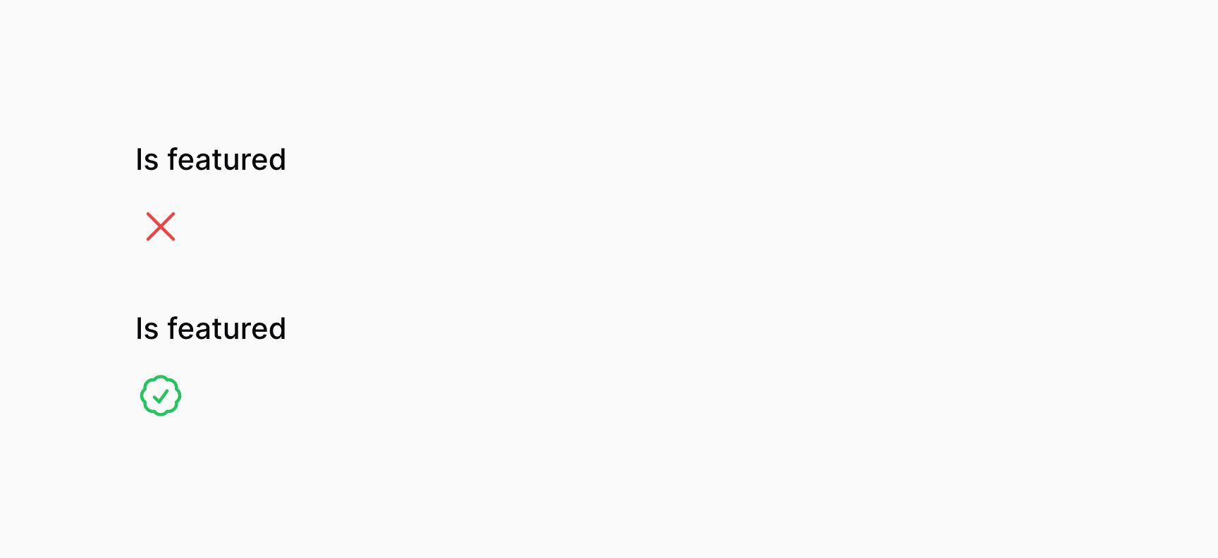
自定义布尔值图标
你可以自定义图标所代表的状态。图标以 Blade 组件名显示。默认情况下,安装了 Heroicons:
use Filament\Infolists\Components\IconEntry;

IconEntry::make('is_featured')
    ->boolean()
    ->trueIcon('heroicon-o-check-badge')
    ->falseIcon('heroicon-o-x-mark')
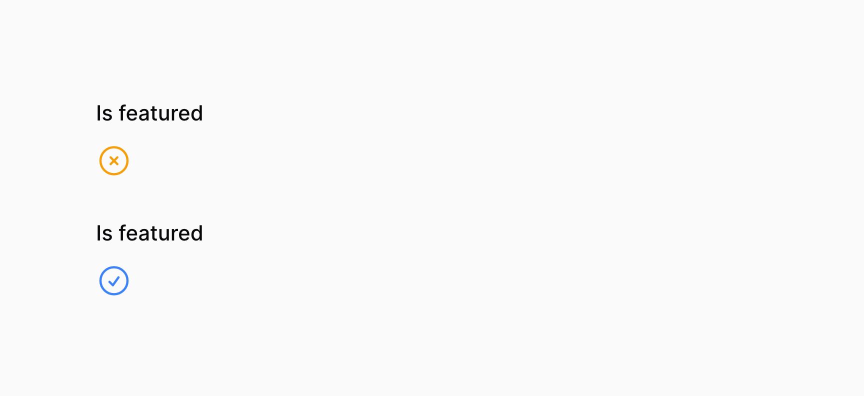
自定义布尔值颜色
你也可以自定义图标颜色所代表的每个状态。这些颜色可以是 danger、gray、info、primary、success 或者 warning:
use Filament\Infolists\Components\IconEntry;

IconEntry::make('is_featured')
    ->boolean()
    ->trueColor('info')
    ->falseColor('warning')