Date-time picker
Overview
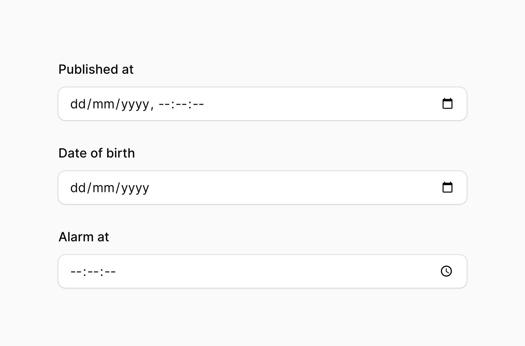
The date-time picker provides an interactive interface for selecting a date and/or a time.
use Filament\Forms\Components\DatePicker;
use Filament\Forms\Components\DateTimePicker;
use Filament\Forms\Components\TimePicker;

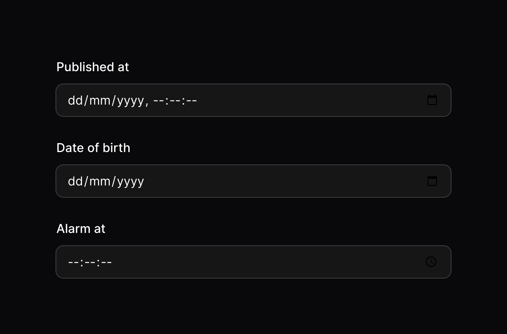
DateTimePicker::make('published_at')
DatePicker::make('date_of_birth')
TimePicker::make('alarm_at')
Customizing the storage format
You may customize the format of the field when it is saved in your database, using the format() method. This accepts a string date format, using PHP date formatting tokens:
use Filament\Forms\Components\DatePicker;

DatePicker::make('date_of_birth')
    ->format('d/m/Y')
Disabling the seconds input
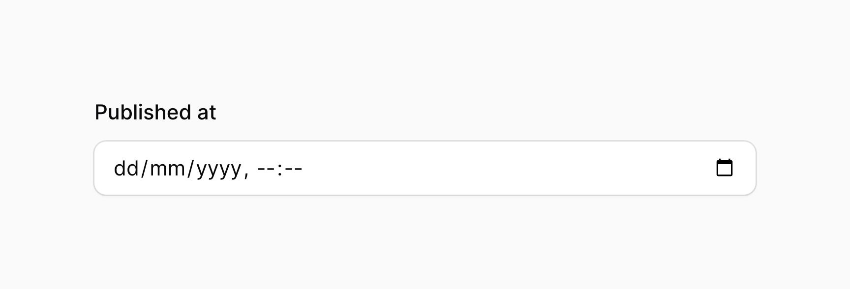
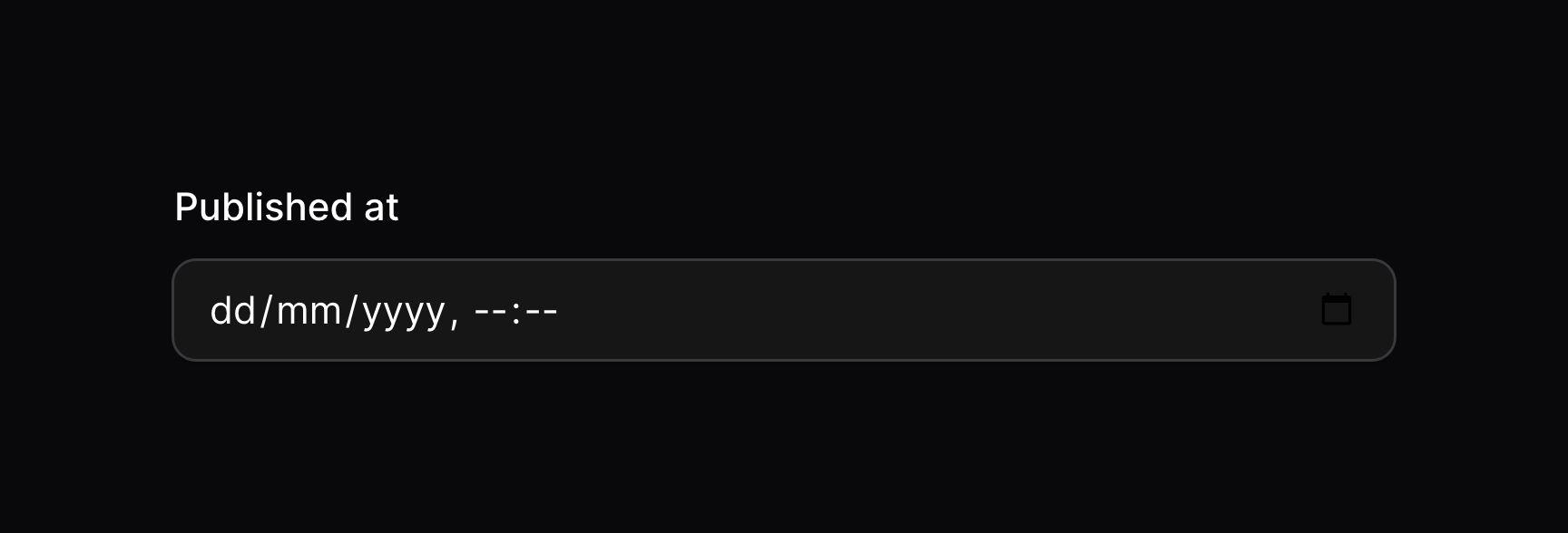
When using the time picker, you may disable the seconds input using the seconds(false) method:
use Filament\Forms\Components\DateTimePicker;

DateTimePicker::make('published_at')
    ->seconds(false)
Timezones
If you'd like users to be able to manage dates in their own timezone, you can use the timezone() method:
use Filament\Forms\Components\DateTimePicker;

DateTimePicker::make('published_at')
    ->timezone('America/New_York')
While dates will still be stored using the app's configured timezone, the date will now load in the new timezone, and it will be converted back when the form is saved.
Enabling the JavaScript date picker
By default, Filament uses the native HTML5 date picker. You may enable a more customizable JavaScript date picker using the native(false) method:
use Filament\Forms\Components\DatePicker;

DatePicker::make('date_of_birth')
    ->native(false)
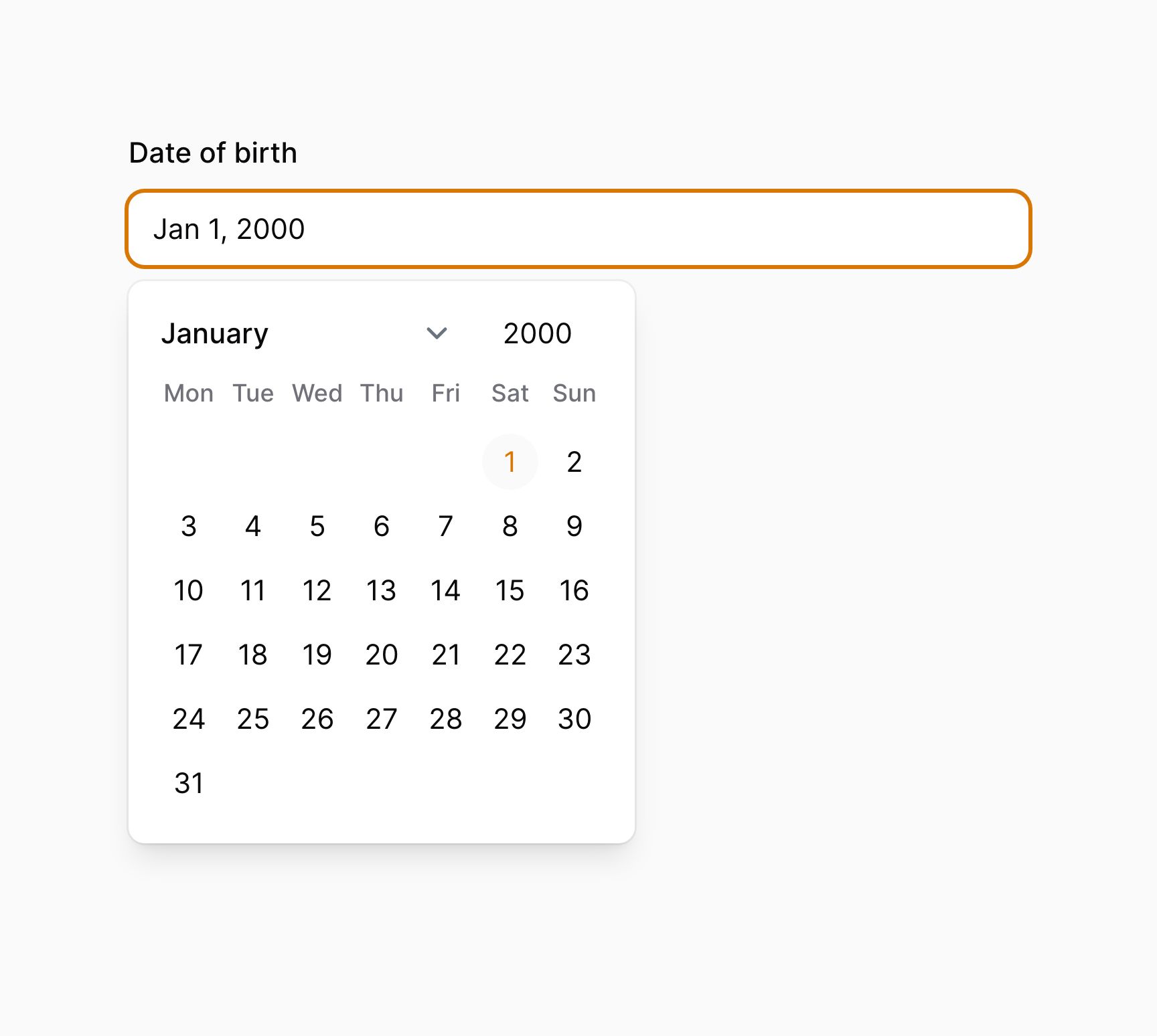
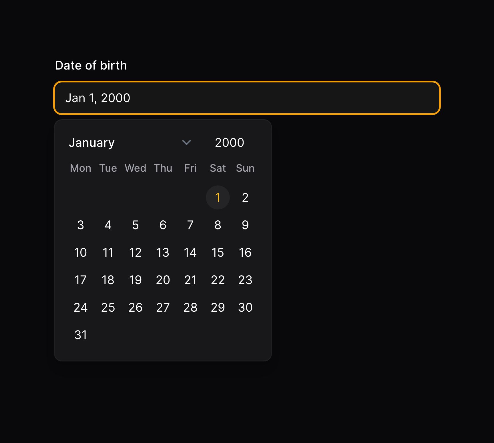
Please be aware that while being accessible, the JavaScript date picker does not support full keyboard input in the same way that the native date picker does. If you require full keyboard input, you should use the native date picker.
Customizing the display format
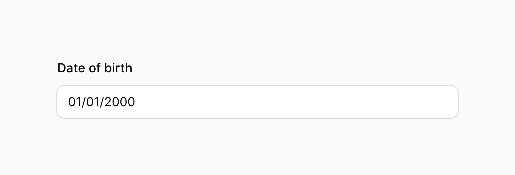
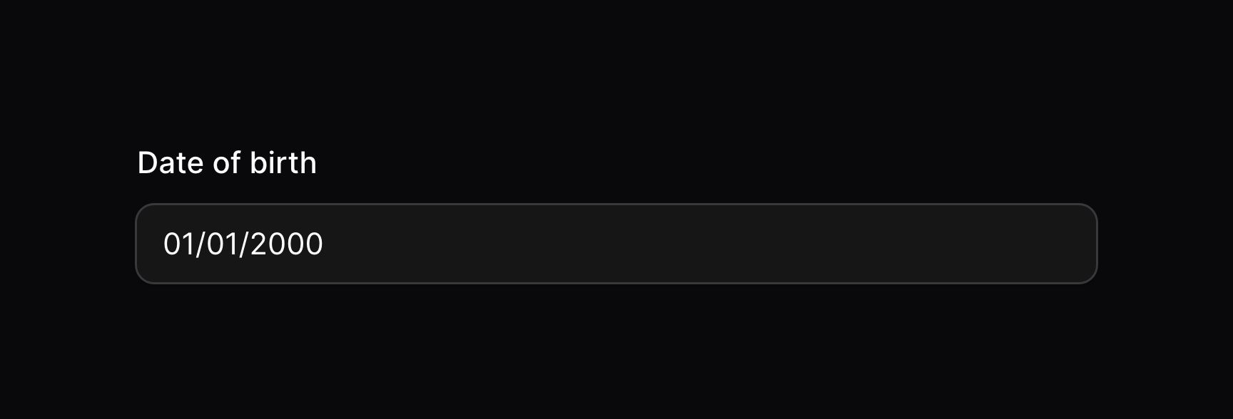
You may customize the display format of the field, separately from the format used when it is saved in your database. For this, use the displayFormat() method, which also accepts a string date format, using PHP date formatting tokens:
use Filament\Forms\Components\DatePicker;

DatePicker::make('date_of_birth')
    ->native(false)
    ->displayFormat('d/m/Y')
Configuring the time input intervals
You may customize the input interval for increasing/decreasing the hours/minutes /seconds using the hoursStep() , minutesStep() or secondsStep() methods:
use Filament\Forms\Components\DateTimePicker;

DateTimePicker::make('published_at')
    ->native(false)
    ->hoursStep(2)
    ->minutesStep(15)
    ->secondsStep(10)
Configuring the first day of the week
In some countries, the first day of the week is not Monday. To customize the first day of the week in the date picker, use the firstDayOfWeek() method on the component. 0 to 7 are accepted values, with Monday as 1 and Sunday as 7 or 0:
use Filament\Forms\Components\DateTimePicker;

DateTimePicker::make('published_at')
    ->native(false)
    ->firstDayOfWeek(7)
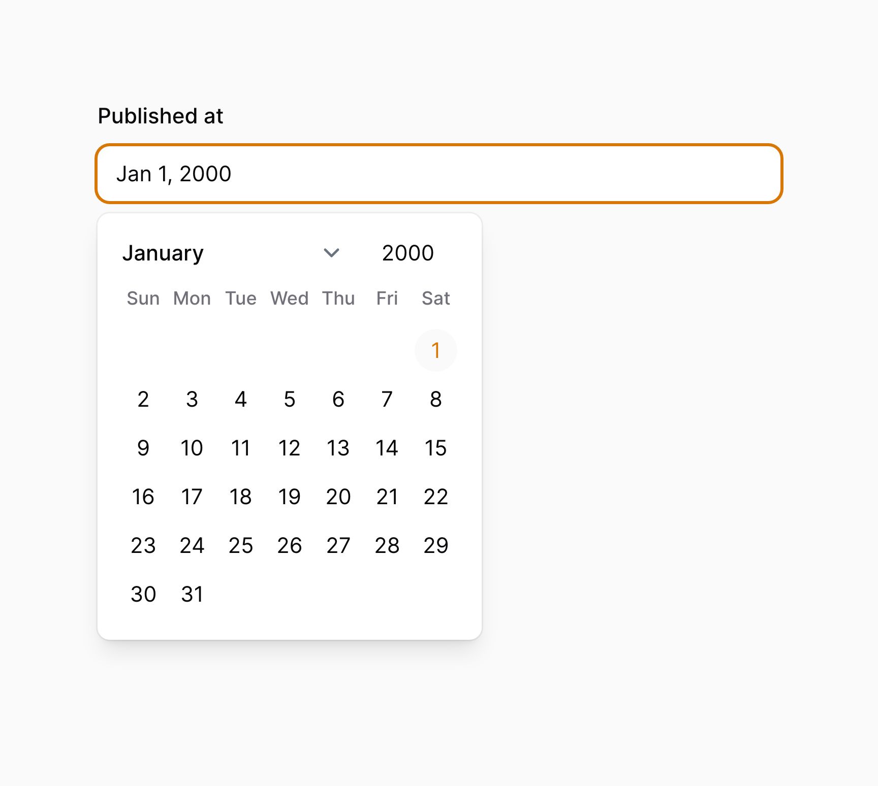
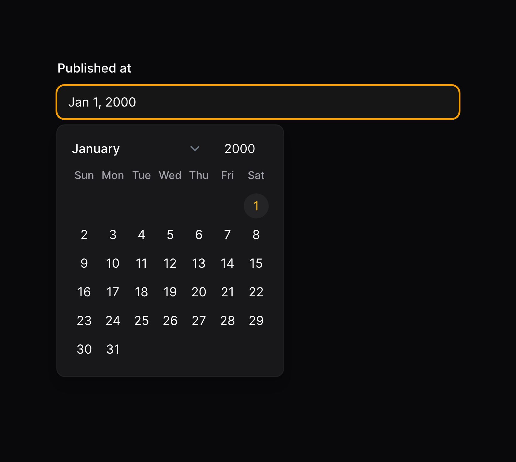
There are additionally convenient helper methods to set the first day of the week more semantically:
use Filament\Forms\Components\DateTimePicker;

DateTimePicker::make('published_at')
    ->native()
    ->weekStartsOnMonday()

DateTimePicker::make('published_at')
    ->native()
    ->weekStartsOnSunday()
Disabling specific dates
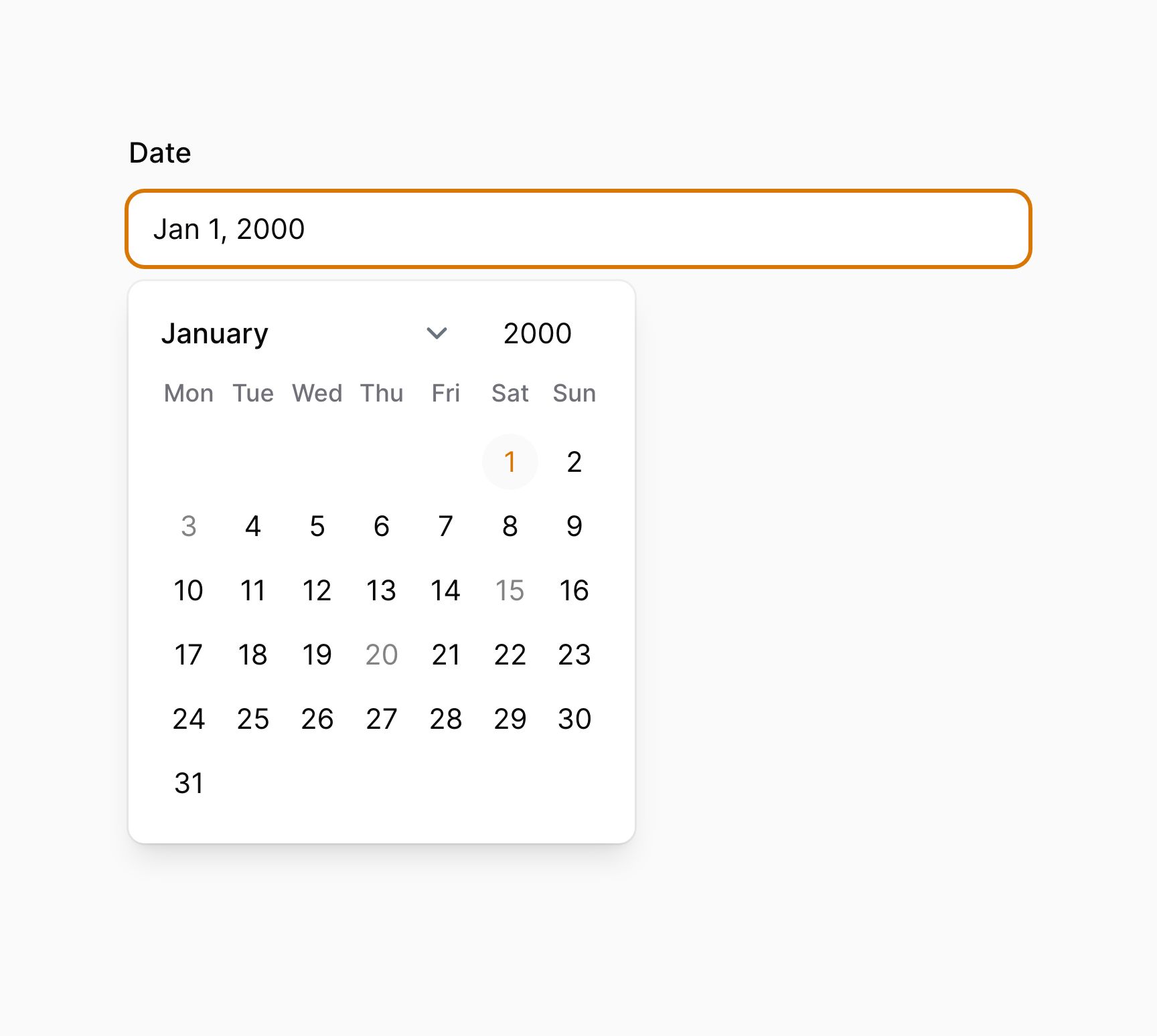
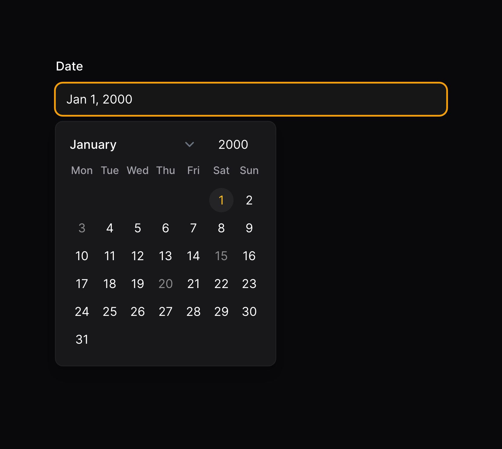
To prevent specific dates from being selected:
use Filament\Forms\Components\DateTimePicker;

DateTimePicker::make('date')
    ->native(false)
    ->disabledDates(['2000-01-03', '2000-01-15', '2000-01-20'])
Closing the picker when a date is selected
To close the picker when a date is selected, you can use the closeOnDateSelection() method:
use Filament\Forms\Components\DateTimePicker;

DateTimePicker::make('date')
    ->native(false)
    ->closeOnDateSelection()
Autocompleting dates with a datalist
Unless you're using the JavaScript date picker, you may specify datalist options for a date picker using the datalist() method:
use Filament\Forms\Components\TimePicker;

TimePicker::make('appointment_at')
    ->datalist([
        '09:00',
        '09:30',
        '10:00',
        '10:30',
        '11:00',
        '11:30',
        '12:00',
    ])
Datalists provide autocomplete options to users when they use the picker. However, these are purely recommendations, and the user is still able to type any value into the input. If you're looking to strictly limit users to a set of predefined options, check out the select field.
Adding affix text aside the field
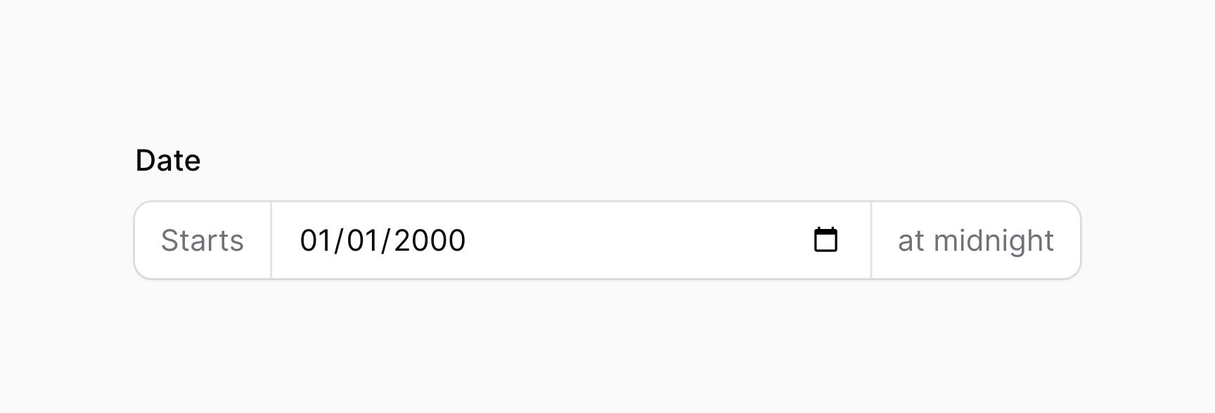
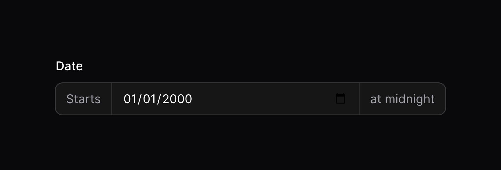
You may place text before and after the input using the prefix() and suffix() methods:
use Filament\Forms\Components\DatePicker;

DatePicker::make('date')
    ->prefix('Starts')
    ->suffix('at midnight')
Using icons as affixes
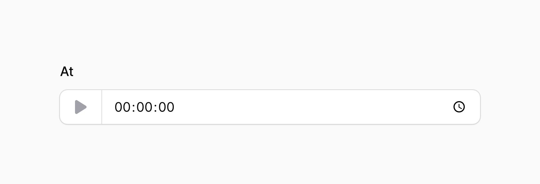
You may place an icon before and after the input using the prefixIcon() and suffixIcon() methods:
use Filament\Forms\Components\TimePicker;

TimePicker::make('at')
    ->prefixIcon('heroicon-m-play')

Date-time picker validation
As well as all rules listed on the validation page, there are additional rules that are specific to date-time pickers.
Max date / min date validation
You may restrict the minimum and maximum date that can be selected with the picker. The minDate() and maxDate() methods accept a DateTime instance (e.g., Carbon), or a string:
use Filament\Forms\Components\DatePicker;

DatePicker::make('date_of_birth')
    ->minDate(now()->subYears(150))
    ->maxDate(now())