Grouping actions
Overview
You may group actions together into a dropdown menu by using an ActionGroup object. Groups may contain many actions, or other groups:
ActionGroup::make([
    Action::make('view'),
    Action::make('edit'),
    Action::make('delete'),
])


This page is about customizing the look of the group's trigger button and dropdown.
Customizing the group trigger style
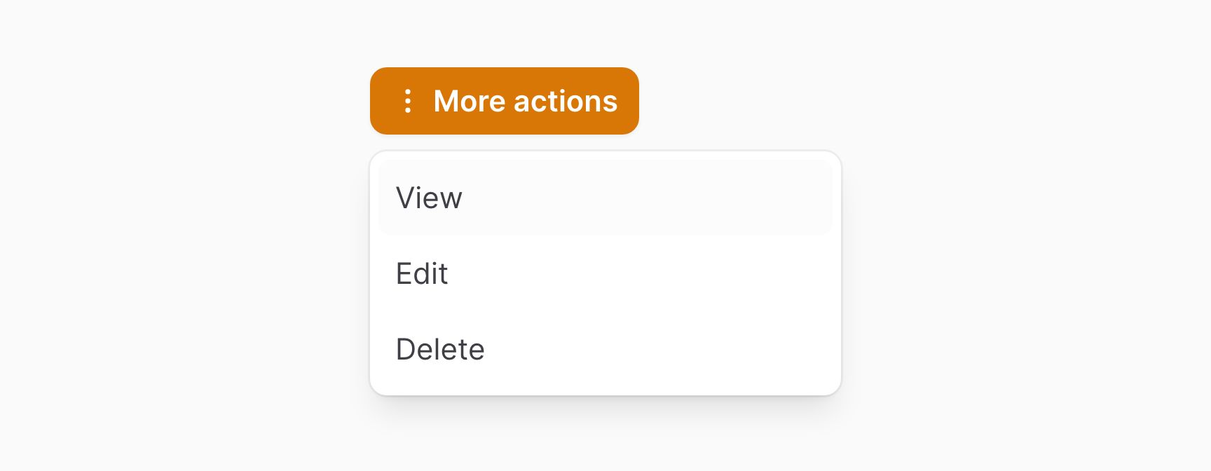
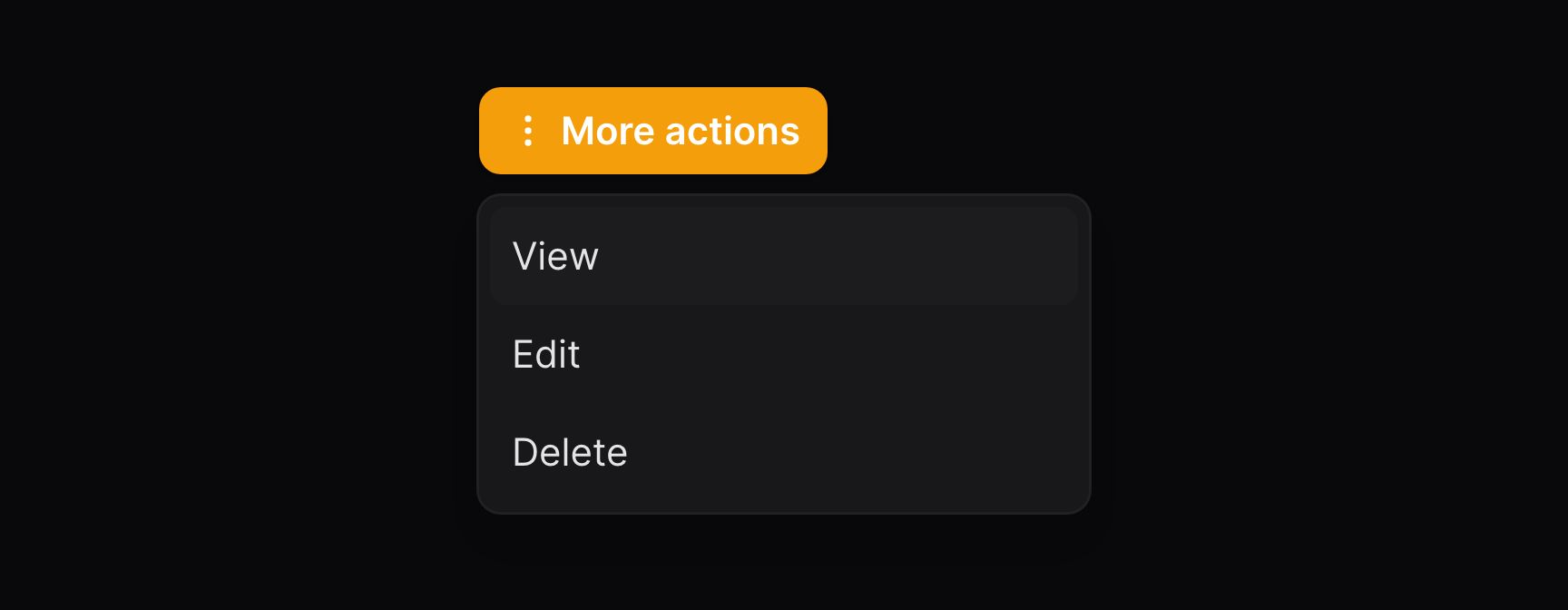
The button which opens the dropdown may be customized in the same way as a normal action. All the methods available for trigger buttons may be used to customize the group trigger button:
use Filament\Support\Enums\ActionSize;

ActionGroup::make([
    // Array of actions
])
    ->label('More actions')
    ->icon('heroicon-m-ellipsis-vertical')
    ->size(ActionSize::Small)
    ->color('primary')
    ->button()
Setting the placement of the dropdown
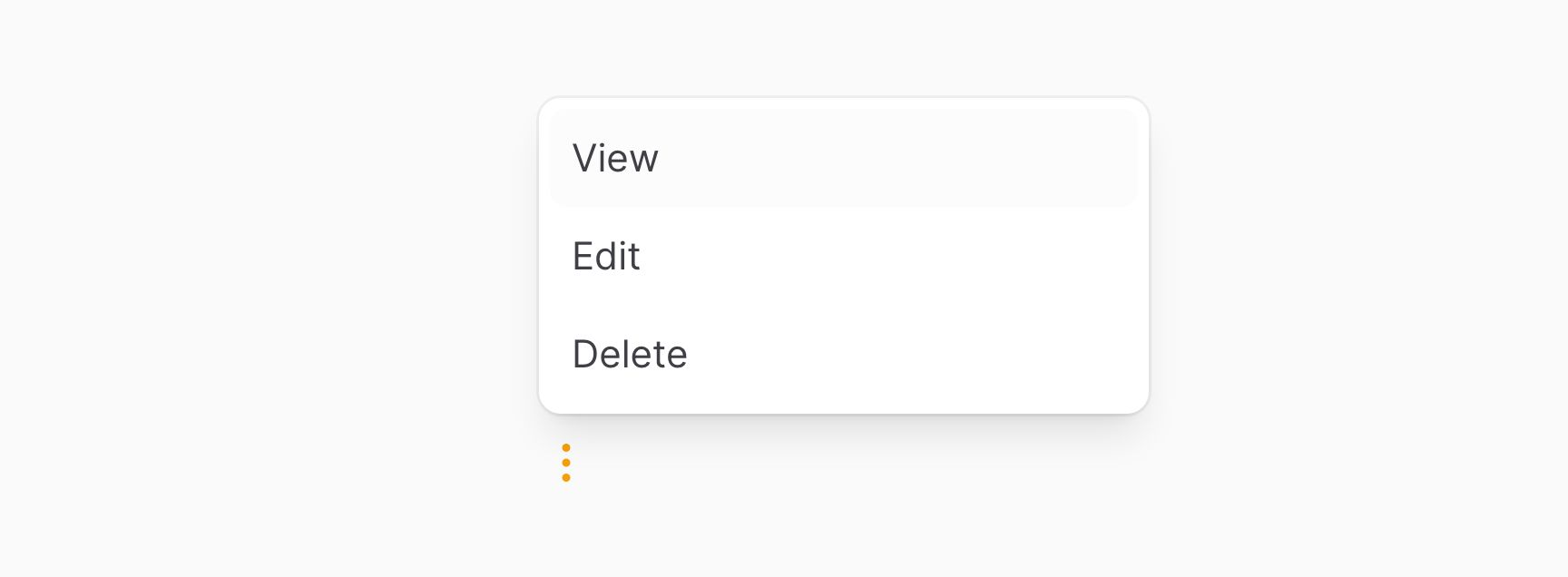
The dropdown may be positioned relative to the trigger button by using the placement() method:
ActionGroup::make([
    // Array of actions
])
    ->placement('top-start')

Adding dividers between actions
You may add dividers between groups of actions by using nested ActionGroup objects:
ActionGroup::make([
    ActionGroup::make([
        // Array of actions
    ])->dropdown(false),
    // Array of actions
])
The dropdown(false) method puts the actions inside the parent dropdown, instead of a new nested dropdown.


Setting the width of the dropdown
The dropdown may be set to a width by using the width() method. Options correspond to Tailwind's max-width scale. The options are xs, sm, md, lg, xl, 2xl, 3xl, 4xl, 5xl, 6xl and 7xl:
ActionGroup::make([
    // Array of actions
])
    ->width('xs')
Controlling the maximum height of the dropdown
The dropdown content can have a maximum height using the maxHeight() method, so that it scrolls. You can pass a CSS length:
ActionGroup::make([
    // Array of actions
])
    ->maxHeight('400px')